My Least Favorite Design Trends
- Jennifer McNamara

- Aug 18, 2020
- 3 min read
Updated: Oct 21, 2020
Fellow haters, this post is for you.

So normally I would not condone putting more negativity out into the world, but, sometimes it’s nice to just sit back and pass judgement on your least favorite design trends am I right? Generally speaking, I would say we are in an age of lovely, high quality design, but not all trends are winners. So sit back, relax, and see if we hate all the same things.
WARNING: There may be some hot takes ahead.
Black Grout
So listen, we all love subway tile, for the most part. I will concede that there are definitely moments when subway tile is not the right choice even though it may be the easy choice. All too often, subway tile that looks sort of out of place or cheap looks that way because of BLACK GROUT. Side note: I know these pics are gorgeous, but imagine how much better they would be with white grout.


Folks, why would we ever want to draw even more attention to grout? It’s grout! Adding in about a million more little black lines all over your kitchen or bathroom will automatically make it look a thousand times busier, which is not really ever something we should want in our homes. Black grout also highlights every single little imperfection in the tiling job. Did you have to cut slightly weird shapes there at the end? Well now we can all tell because of the black grout. Are those tiles not 100% straight? We can tell. Not about it.
White Metal Railing and Slats as Staircase Railings
Now, these aren’t something you see all the time, but when they show up, They. Are. A. Choice. And honestly, one that I think a lot of people are going to regret. In my opinion, white metal railing never looked trendy. It instantly dates the house and reminds me of cheap motel railing. And wooden slats are one of those super futuristic, ultra trendy designs that is a little reminiscent of the “trendiness” of the 70s. It’s not going to last. And unlike many trendy design choices, this is not low commitment, it’s your entire staircase.


There is also a 90% chance that you don’t live in the type of house that can pull this look off. There is a huge chance that it’s going to look totally out of place and be one of those “huh…..interesting” items when your house goes to resell.
Extreme Wall Colors (Especially THAT blue)
Ok. This one I hate. I know that Pantone said the color of the year was classic blue. But that does not mean you should paint your entire interior that color. Yes, paint is a low commitment choice that you can easily change. However, this particular blue color is the type of trend you are going to want to change after a year if not less. It’s TOO MUCH.


It’s also the exact color of a blue screen and no matter where it shows up, it looks cheap. It doesn’t matter if it’s glossy or matte it looks cheap. Always. You know that effect that happens when you use the wrong kind of paint on a surface? It looks really strange and there is an immediate sense of “that paint doesn’t belong there”. This color does not belong on walls. Stop it. Stop it right now.
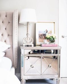
Mirrored Furniture
Tacky. Maybe it’s trying to be high end, but I just don’t see it. I don’t have a lot to say about it, I just don’t like it.


Black Trim (Used incorrectly)
Before you flip out, I absolutely love the trend where you have a white exterior, charcoal or black metal roof, and then black trim on the windows. The reason why this works is because those are almost always thin windows. What I don’t like to see is thick, original wood trim that has been painted black. In almost every single circumstance I think “Imagine what this would look like if it was the original color”. If you have original wood trim and it’s nice and thick and you absolutely must paint it, paint it all white. Save that black trim window dream for different windows.


I also love a good black door in the house, but not if all of the trim along the floors and ceiling is also black. It creates such a weird flow where your eye follows the very edges of the room. Almost like you’ve used a super thick black sharpie to outline the room. It also always makes me feel like the room is smaller and more confined. So paint the door black, but leave that trim white please.
Now that you’ve spent the last 5-ish minutes reading my judgmental ranting, remember that your style is your own and it’s perfect if you love it. Unless you paint your home cobalt or classic blue. Just please don’t do that one.

コメント